
Seaborn
✕Introduction to Seaborn
- Extension of Matplotlib for statistical data visualization.
- Installed as:
pip install seaborn. - Supports complex visualizations with less code.
- Charts:
scatterplot,lineplot,barplot,histplot,boxplot,heatmapetc. - Integrates with Matplotlib for further customization.
- Example:
import seaborn as sns
import matplotlib.pyplot as plt

df = sns.load_dataset("tips")
fig, ax = plt.subplots()
sns.scatterplot(data=df, x="total_bill", y="tip", ax=ax)
ax.set_title("Scatter Plot with Seaborn")
plt.show()
Line Plot in Seaborn
- Used to show trends over time or continuous data.
- Created with
sns.lineplot(). - Matplotlib attributes like
linestyle,color,linewidthare valid. hue: Adds color encoding based on a categorical variable.- Example:
import seaborn as sns
import matplotlib.pyplot as plt

df = sns.load_dataset("fmri")
fig, ax = plt.subplots()
sns.lineplot(data=df, x="timepoint", y="signal", hue="event", ax=ax)
ax.set_title("Line Plot with Seaborn")
plt.show()
Bar Plot in Seaborn
- Used to compare values across categories.
categoricalvsnumeric. - Created with
sns.barplot(). estimator: Function that computes the bar height. Default ismean.orientation:vertical(default) orhorizontalfor horizontal bars.- Order and hue order can be controlled with
orderandhue_orderparameters. - Adds standard error bars which can be customized with
errorbarparameter. - Example:
import seaborn as sns
import matplotlib.pyplot as plt

df = sns.load_dataset("tips")
fig, ax = plt.subplots()
sns.barplot(data=df, x="day", y="total_bill", hue="sex", ax=ax)
ax.set_title("Bar Plot with Seaborn")
plt.show()
Scatter Plot in Seaborn
- Used to show relationship between two continuous variables.
- Created with
sns.scatterplot(). - Parameters:
hue,size,markers,edgecolor,alpha,linewidthetc. - Example:
import seaborn as sns
import matplotlib.pyplot as plt

df = sns.load_dataset("tips")
fig, ax = plt.subplots()
sns.scatterplot(data=df, x="total_bill", y="tip", hue="sex", ax=ax)
ax.set_title("Scatter Plot with Seaborn")
plt.show()
Box Plot in Seaborn
- Used to show the distribution of a continuous variable across categories.
- Parameters:
hue,order,hue_order,width,fliersize,linewidth,showcaps,boxprops,medianprops, etc. - Example:
import seaborn as sns
import matplotlib.pyplot as plt

df = sns.load_dataset("tips")
fig, ax = plt.subplots()
sns.boxplot(data=df, x="day", y="total_bill", ax=ax)
ax.set_title("Box Plot with Seaborn")
plt.show()
Histogram in Seaborn
- Used to show the distribution of a single continuous variable.
- Created with
sns.histplot(). Customizations of Matplotlib valid. - Example:
import seaborn as sns
import matplotlib.pyplot as plt

df = sns.load_dataset("tips")
fig, ax = plt.subplots()
sns.histplot(data=df, x="total_bill", bins=30, kde=True, ax=ax)
ax.set_title("Histogram with Seaborn")
plt.show()
Heatmap in Seaborn
- Used to show data as colors in a matrix format.
- Created with
sns.heatmap(). - Parameters:
annot,fmt,cmap,linewidths,linecolor,annot_kws,squareetc. - Example:
import seaborn as sns
import matplotlib.pyplot as plt

df = sns.load_dataset("tips")
fig, ax = plt.subplots()
tabular_data = pd.crosstab(df["day"], df["sex"])
sns.heatmap(data=tabular_data, annot=True, ax=ax)
ax.set_title("Heatmap with Seaborn")
plt.show()
Count Plot in Seaborn
- Used to show the count of observations in each categorical bin.
- Created with
sns.countplot(). - Parameters:
hue,order,hue_order,paletteetc. - Example:
import seaborn as sns
import matplotlib.pyplot as plt

df = sns.load_dataset("tips")
fig, ax = plt.subplots()
sns.countplot(data=df, x="day", ax=ax)
ax.set_title("Count Plot with Seaborn")
plt.show()
Figure Level Plots in Seaborn
- Figure-level plots are created with
sns.relplot(),sns.catplot(),sns.displot(). - They create their own figure and can be used for complex visualizations.
- We can create sub-plots by specifying
colandrowparameters. - Example:
import seaborn as sns
import matplotlib.pyplot as plt

df = sns.load_dataset("tips")
sns.relplot(data=df, x="total_bill", y="tip", hue="day", kind="scatter")
plt.show()
Relational Plot in Seaborn
- Used to show relationships between two variables.
- Created with
sns.relplot().kindcontrols the type of plot (scatter,line). - Customizations of
lineplotandscatterplotare valid forrelplot. - Parameters:
hue,col,row,col_wrap,alphaetc. - Example:
import seaborn as sns
import matplotlib.pyplot as plt

df = sns.load_dataset("tips")
sns.relplot(data=df, x="total_bill", y="tip", kind="scatter", col="day")
plt.show()
Customizing Figure Level Plots of Seaborn
- Figure-level plots can be customized using the returned
FacetGridobject. suptitle,xlabel,ylim,xticks,xticklabelsetc. can be set on the figure.- Example:
import seaborn as sns
import matplotlib.pyplot as plt

df = sns.load_dataset("tips")
g = sns.relplot(data=df, x="total_bill", y="tip", kind="line", row="day")
g.figure.suptitle("Line Plot with Seaborn")
g.set(ylim=(0, 10))
g.set(xlabel="Total Bill", ylabel="Tip")
plt.show()
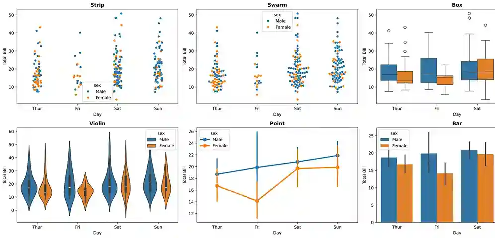
Categorical Plot in Seaborn
- Used to show the distribution of a categorical variable.
- Created with
sns.catplot().kindcontrols the type of plot.
Categorical Plot Types in Seaborn:
| Kind | Description | Best For |
|---|---|---|
| strip | Shows all data points with jitter to avoid overlap. | Comparing distributions across categories |
| swarm | Similar to strip plot but adjusts points to avoid overlap. | Showing all data points with minimal overlap |
| box | Shows distribution with box plot. | Displaying summary statistics and outliers |
| violin | Shows distribution with a kernel density estimate. | Visualizing the shape of the distribution |
| bar | Shows mean (or other estimator) with confidence intervals. | Comparing central tendency across categories |
| point | Same as bar plot but shows individual data points. | Comparing central tendency with individual data points |
| count | Shows count of observations in each categorical bin. | Showing the frequency of each category |
Different types of categorical plots available in Seaborn for visualizing categorical data
Figure Showing Different Categorical Plots
Sample Code for Categorical Plots in Seaborn
import seaborn as sns import matplotlib.pyplot as plt df = sns.load_dataset("tips") g = sns.catplot(data=df, x="day", y="total_bill", kind="violin", col="sex") g.set(xlabel="Day of Week", ylabel="Total Bill", title="Total Bill by Day") plt.show()- Try different
kindvalues to see various categorical plots and understand their differences.
Distribution Plot in Seaborn
- Used to show the distribution of a single continuous variable.
- Created with
sns.displot().kindcontrols the type of plot (hist,kde,ecdf). - Pass
kde=Trueto show kernel density estimate on top of histogram. - Customizations of Matplotlib valid for
displot. - Example:
import seaborn as sns
import matplotlib.pyplot as plt

df = sns.load_dataset("tips")
sns.displot(data=df, x="total_bill", kind="hist", bins=30, kde=True)
ax.set_title("Distribution Plot with Seaborn")
plt.show()
lmplot in Seaborn
- Shows scatter plot with a fitted regression line.
- Created with
sns.lmplot(). - Combines
regplotandFacetGridfor complex visualizations. - Order of polynomial regression can be set with
orderparameter. - Example:
import seaborn as sns
import matplotlib.pyplot as plt

df = sns.load_dataset("tips")
g = sns.lmplot(data=df, x="total_bill", y="tip", col="day")
g.fig.suptitle("Linear Relationship with Seaborn")
plt.show()
Joint Plot in Seaborn
- Shows scatter plot with marginal histograms or KDEs.
- Created with
sns.jointplot().kindcontrols the type of plot. - Example:
import seaborn as sns
import matplotlib.pyplot as plt

df = sns.load_dataset("tips")
sns.jointplot(data=df, x="total_bill", y="tip", kind="scatter")
plt.show()
Pair Plot in Seaborn
- Shows pairwise relationships in a dataset.
- Create
n x ngrid of plots for n variables where, - diagonal shows univariate distribution - off-diagonal shows bivariate relationships. - Created with
sns.pairplot(). - Parameters:
hue,vars,x_vars,y_vars,kind,diag_kindetc. - Example:
import seaborn as sns
import matplotlib.pyplot as plt

df = sns.load_dataset("tips")
sns.pairplot(data=df)
plt.show()
Changing Context and Color Palette
- Controls the scale of plot elements to suit different contexts.
- Options:
paper(smallest),notebook(default),talk,poster(largest). - Set context with
sns.set_context("context_name"). - Controls the color scheme of plots.
- Options:
deep,muted,bright,pastel,dark,colorblind. - Set palette with
sns.set_palette("palette_name"). - Customization of style using Matplotlib is still valid when using Seaborn.
- Adjust
style,context,palettetogether to create visual for your purpose.
Context:
Color Palette: