
Data Visualization Concepts
✕Importance of Data Visualization
- Crucial for summarizing, identifying patterns, conveying insights.
- Multiple charts can be used to tell a compelling data story.
- Each chart should have a clear purpose and message.
- Visuals compress complex data into interpretable patterns
- Use charts to compare categories, track trends, and reveal relationships
- Visualization accelerates exploratory analysis and communication
- Good visuals reduce ambiguity in business decisions
How to Choose the Right Visualization
Chart Types and Their Best Use Cases:
| Chart Type | Best Use Case | Examples |
|---|---|---|
| Line Chart | Showing trends over time or continuous data. Numeric vs Continuous. | Stock price over time, website traffic trends. |
| Bar Chart | Comparing values across categories. Categorical vs Numeric. | Sales by product category, revenue by region. |
| Scatter Plot | Showing relationships between two continuous variables. Numeric vs Numeric. | Correlation between height and weight. |
| Histogram | Displaying the distribution of a single continuous variable. Numeric. | Distribution of exam scores. |
| Pie Chart | Showing parts of a whole Categorical vs Numeric. | Market share by product category. |
| Heatmap | Displaying data as colors in a matrix format. Categorical vs Categorical. | User engagement by day and hour. |
| Box Plot | Distribution and outliers of a continuous variable across categories. Categorical vs Numeric. | Income distribution by education level. |
Common chart types and their best use cases for data visualization
Figure Showing Different Chart Types
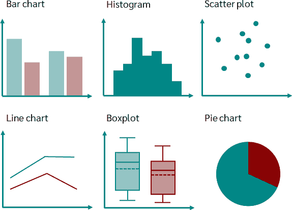
Chart Design Principles and Guidelines
- Keep it simple and avoid clutter.
- Use appropriate chart types for the data and message.
- Use color and labels effectively to enhance readability.
- Ensure axes are labeled and scaled appropriately.
- Use consistent formatting and styling across charts.
- Focus on the key message and avoid unnecessary elements.
- Use clear titles, axis labels, units, and legend semantics
- Avoid misleading scales and overdecorated charts
- Choose color palettes for readability and accessibility
- Tell one clear insight per visualization whenever possible