Seaborn
1. Introduction to Seaborn
- Seaborn is a Python library for statistical data visualization.
It is built on Matplotlib and provides a higher-level interface for creating informative statistical graphics with less code.
Seaborn supports charts such as: line plots, bar plots, scatter plots, histograms, box plots, heatmaps, count plots, regression plots, multi-plot grids.
Install Seaborn using:
pip install seabornImport it using:import seaborn as sns📌 Seaborn simplifies statistical visualization while still allowing Matplotlib customization. - Seaborn creates the main visualization, while Matplotlib can customize elements such as: titles, axis labels, axis limits, figure size, legends, grid lines, saving.
Example:
import seaborn as snsimport matplotlib.pyplot as pltdf = sns.load_dataset("tips")fig, ax = plt.subplots()sns.scatterplot(data=df,x="total_bill",y="tip",ax=ax)ax.set_title("Relationship Between Total Bill and Tip")ax.set_xlabel("Total Bill")ax.set_ylabel("Tip")plt.show()📌 We can create a chart with Seaborn and customize it using Matplotlib. - Seaborn provides sample datasets for learning and demonstration.
Example:
df = sns.load_dataset("tips")Thetipsdataset includes information such as: total bill, tip amount, day, time, customer-related categories. 📌 In real projects, we usually load our own DataFrame using Pandas.
1.1 📊 What is Seaborn?
1.2 Seaborn and Matplotlib Together
1.3 About sns.load_dataset()
2. Axes-Level and Figure-Level Functions
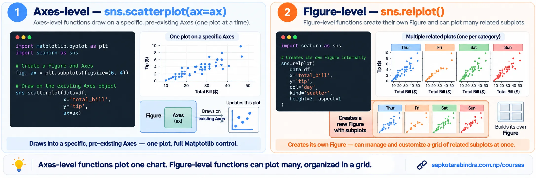
- Axes-level functions draw one plot on a Matplotlib Axes.
Examples:
sns.scatterplot(),sns.lineplot(),sns.barplot(),sns.histplot(),sns.boxplot(),sns.countplot(),sns.heatmap(). We can pass an Axes using:ax=axExample:fig, ax = plt.subplots()sns.scatterplot(data=df,x="total_bill",y="tip",ax=ax)Axes-level functions plot on one Matplotlib Axes and return that Axes. - Figure-level functions manage their own Figure and usually return a Seaborn grid object.
Examples:
sns.relplot(),sns.catplot(),sns.displot(),sns.lmplot(),sns.jointplot(),sns.pairplot(). They are useful for creating multiple related plots using parameters such as:row,col,col_wrap. Figure-level functions normally manage the Figure through objects such asFacetGrid,PairGrid, orJointGrid. 📌 Axes-level functions create one plot. Figure-level functions can manage an entire group of plots.
2.1 🧩 Axes-Level Functions
2.2 Figure-Level Functions
3. Line Plot in Seaborn
- A line plot is used to show trends over time or another continuous sequence.
It is created using:
sns.lineplot()Common parameters include:x,y,hue,style,size,marker,linewidth,linestyle. - The
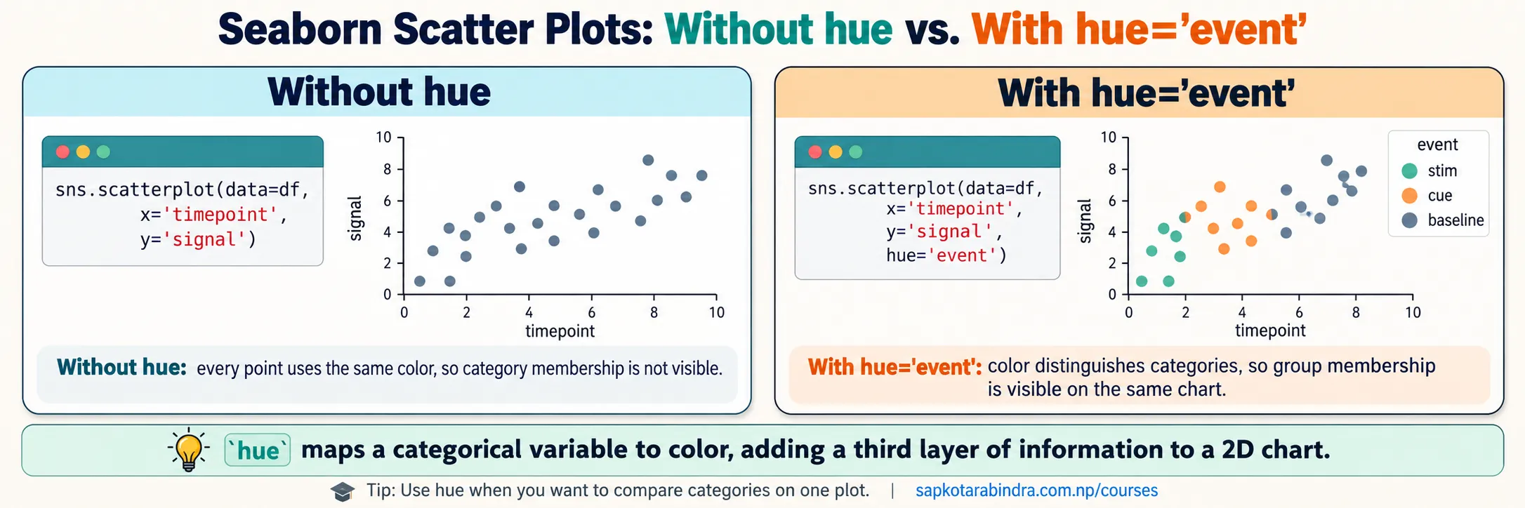
hueparameter uses color to represent another variable. Example:hue="event"Each event category will be shown using a different color. Color, size, and style can represent additional variables in relational plots.
3.1 📈 What is a Line Plot?
3.2 What is hue?
- Example:
import seaborn as snsimport matplotlib.pyplot as pltdf = sns.load_dataset("fmri")fig, ax = plt.subplots()sns.lineplot(data=df,x="timepoint",y="signal",hue="event",ax=ax)ax.set_title("Signal Over Time")ax.set_xlabel("Time Point")ax.set_ylabel("Signal")plt.show()📌 Use hue when you want to compare multiple groups on the same chart.
3.3 Line Plot Example
4. Bar Plot in Seaborn
- A bar plot compares a numeric measurement across categories.
It is created using:
sns.barplot()By default,sns.barplot()calculates the mean of the numeric variable for each category. 📌 A Seaborn bar plot summarizes observations. It does not simply draw every original numeric value. - estimator: Determines how the bar height is calculated.
Default:
estimator="mean"Example using sum:estimator="sum"hue: Creates separate bars using another categorical variable. order: Controls the order of categories.order=["Thur", "Fri", "Sat", "Sun"]hue_order: Controls the order of the hue categories. orient: Controls bar orientation.orient="v"or:orient="h"errorbar: Controls the uncertainty or variability displayed around the estimate. - Example:
import seaborn as snsimport matplotlib.pyplot as pltdf = sns.load_dataset("tips")fig, ax = plt.subplots()sns.barplot(data=df,x="day",y="total_bill",hue="sex",errorbar="sd",ax=ax)ax.set_title("Average Total Bill by Day")ax.set_xlabel("Day")ax.set_ylabel("Average Total Bill")plt.show()📌 Each bar represents a summary value for one category.
4.1 📊 What is a Bar Plot?
4.2 Important Parameters
4.3 Bar Plot Example
5. Scatter Plot in Seaborn
- A scatter plot shows the relationship between two numeric variables.
It is created using:
sns.scatterplot()A scatter plot represents each observation as a point and helps reveal possible relationships, clusters, and unusual observations. huechanges point color.sizechanges point size.stylechanges marker shape.alphachanges transparency.edgecolorchanges point-border color.linewidthchanges point-border thickness.- Example:
import seaborn as snsimport matplotlib.pyplot as pltdf = sns.load_dataset("tips")fig, ax = plt.subplots()sns.scatterplot(data=df,x="total_bill",y="tip",hue="sex",style="sex",ax=ax)ax.set_title("Relationship Between Total Bill and Tip")ax.set_xlabel("Total Bill")ax.set_ylabel("Tip")plt.show()📌 Using both hue and style can make categories easier to distinguish.
5.1 🔵 What is a Scatter Plot?
5.2 Common Parameters
5.3 Scatter Plot Example
6. Box Plot in Seaborn
- A box plot shows the distribution of a numeric variable across categories.
It displays: median, quartiles, spread, possible outliers.
It is created using:
sns.boxplot() hue,order,hue_order,width,fliersize,linewidth,showcaps,boxprops,medianprops.- Example:
import seaborn as snsimport matplotlib.pyplot as pltdf = sns.load_dataset("tips")fig, ax = plt.subplots()sns.boxplot(data=df,x="day",y="total_bill",ax=ax)ax.set_title("Total Bill Distribution by Day")ax.set_xlabel("Day")ax.set_ylabel("Total Bill")plt.show()📌 Use a box plot to compare distributions and possible outliers across categories.
6.1 📦 What is a Box Plot?
6.2 Common Parameters
6.3 Box Plot Example
7. Histogram in Seaborn
- A histogram shows the distribution of one numeric variable.
It divides values into intervals called bins.
It is created using:
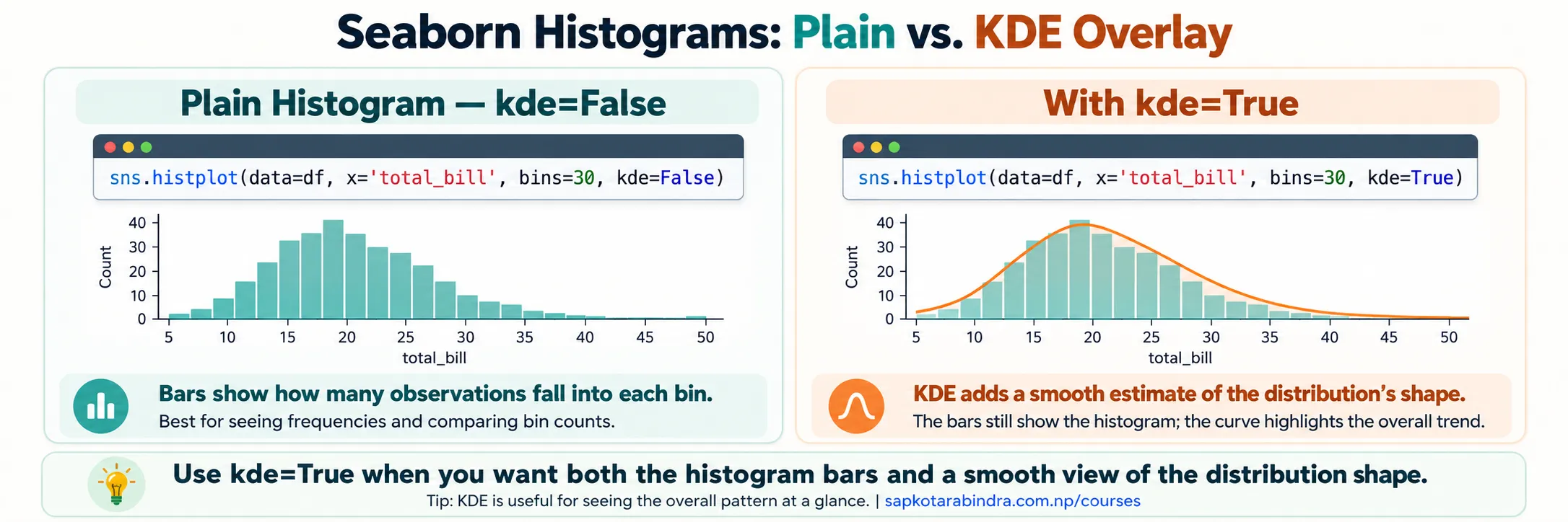
sns.histplot() - KDE means Kernel Density Estimate.
It adds a smooth curve that estimates the shape of the distribution.
kde=True📌 The histogram shows frequency using bars. The KDE shows an estimated distribution using a smooth curve.
7.1 📶 What is a Histogram?
7.2 What is kde=True?
- Example:
import seaborn as snsimport matplotlib.pyplot as pltdf = sns.load_dataset("tips")fig, ax = plt.subplots()sns.histplot(data=df,x="total_bill",bins=30,kde=True,ax=ax)ax.set_title("Distribution of Total Bills")ax.set_xlabel("Total Bill")ax.set_ylabel("Frequency")plt.show()
7.3 Histogram Example
8. Heatmap in Seaborn
- A heatmap displays numeric values as colors in a matrix. It is created using:
sns.heatmap()Heatmaps are useful for: correlation matrices, cross-tabulated values, activity by day and hour, values organized by rows and columns. annot=True➜ Displays values inside cells.fmt➜ Controls annotation format.cmap➜ Controls the color map.linewidths➜ Controls space between cells.linecolor➜ Controls boundary color.square=True➜ Creates square cells.annot_kws➜ Customizes annotation text.- Example:
import pandas as pdimport seaborn as snsimport matplotlib.pyplot as pltdf = sns.load_dataset("tips")tabular_data = pd.crosstab(df["day"],df["sex"])fig, ax = plt.subplots()sns.heatmap(data=tabular_data,annot=True,fmt="d",cmap="Blues",ax=ax)ax.set_title("Customer Count by Day and Category")plt.show()📌 annot=True displays the values inside the cells.
8.1 🌡️ What is a Heatmap?
8.2 Common Parameters
8.3 Heatmap Example
9. Count Plot in Seaborn
- A count plot shows the number of observations in each category.
It is created using:
sns.countplot()Unlikebarplot(), a count plot does not require a numeric Y variable. - Example:
import seaborn as snsimport matplotlib.pyplot as pltdf = sns.load_dataset("tips")fig, ax = plt.subplots()sns.countplot(data=df,x="day",hue="time",ax=ax)ax.set_title("Number of Observations by Day")ax.set_xlabel("Day")ax.set_ylabel("Count")plt.show()📌 Use a count plot when you want to count how often each category appears.
9.1 🔢 What is a Count Plot?
9.2 Count Plot Example
10. Figure-Level Plots in Seaborn
- Figure-level plots manage their own Figure. Each figure level plot provides access to several related axes-level plots using the
kindparameter. Three main figure-level interfaces are:
10.1 🖼️ What are Figure-Level Plots?
Figure-Level Interfaces
| Function | Purpose |
|---|---|
sns.relplot() | Relationships |
sns.catplot() | Categorical data |
sns.displot() | Distributions |
The three main figure-level interfaces in Seaborn
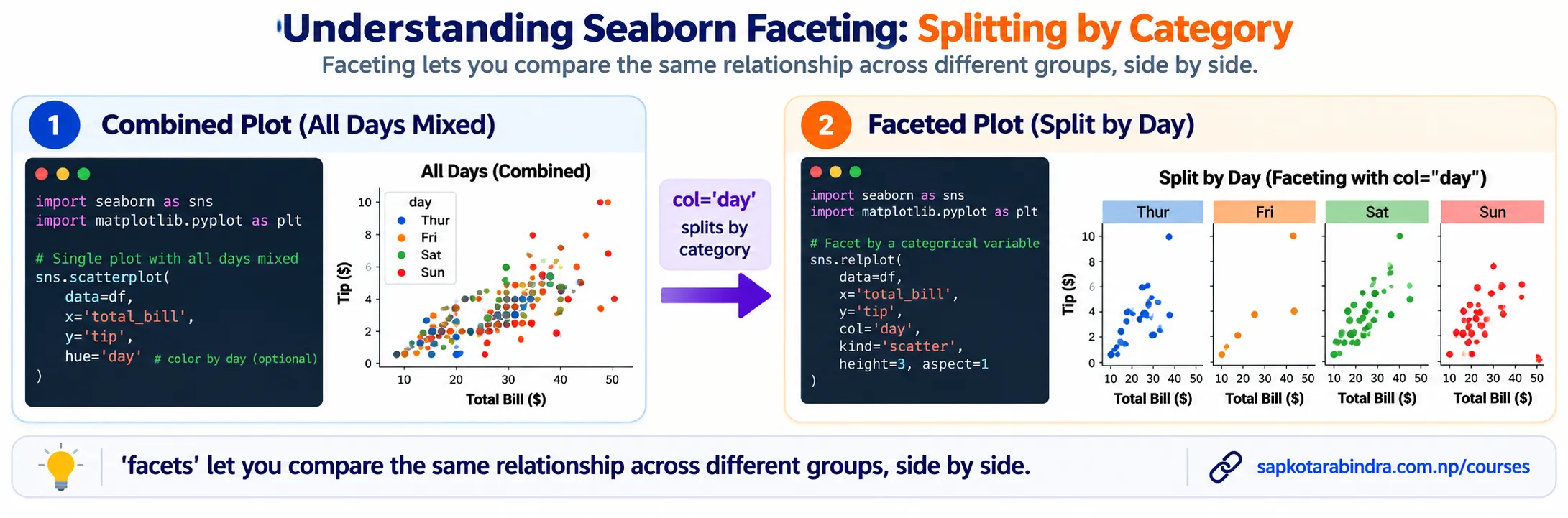
- Facets are multiple related plots created by splitting data into groups.
Use:
row,col,col_wrapExample:sns.relplot(data=df,x="total_bill",y="tip",col="day")This creates a separate plot for each day. 📌 Facets help compare the same relationship across different groups.
10.2 Creating Facets
11. Relational Plot
relplot()is a figure-level function used to visualize statistical relationships. It supports:kind="scatter",kind="line"It combines aFacetGridwith eitherscatterplot()orlineplot().- Example:
import seaborn as snsimport matplotlib.pyplot as pltdf = sns.load_dataset("tips")g = sns.relplot(data=df,x="total_bill",y="tip",kind="scatter",col="day",col_wrap=2)g.set_axis_labels("Total Bill", "Tip")plt.show()📌 col="day" creates a separate plot for each day.
11.1 🔗 What is relplot()?
11.2 Relational Plot Example
12. Customizing Figure-Level Plots
- Figure-level functions return objects such as
FacetGrid.g = sns.relplot(...)We can usegto customize the full collection of plots. - Example:
import seaborn as snsimport matplotlib.pyplot as pltdf = sns.load_dataset("tips")g = sns.relplot(data=df,x="total_bill",y="tip",kind="scatter",row="day")g.figure.suptitle("Tip Relationship by Day",y=1.02)g.set(xlim=(0, 60),ylim=(0, 12))g.set_axis_labels("Total Bill","Tip")plt.show()📌 g.figure.suptitle() sets an overall title. 📌 g.set() applies settings across the facets. 📌 g.set_axis_labels() sets common axis labels.
12.1 🎨 Using the Returned Grid Object
12.2 Customization Example
13. Categorical Plot
catplot()is a figure-level function for categorical visualizations. Thekindparameter controls the chart type.- The kind parameter supports the following categorical plot types:
13.1 📊 What is catplot()?
13.2 Common Categorical Plot Types
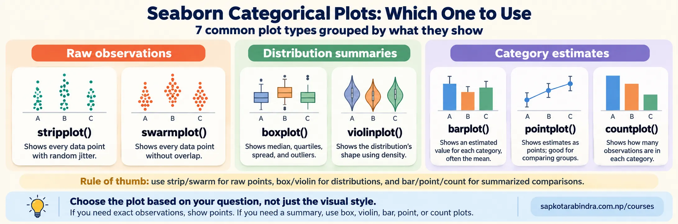
Common Categorical Plot Types
| Kind | Description | Best Use |
|---|---|---|
| strip | Shows observations with optional jitter | Viewing individual observations across categories |
| swarm | Adjusts points to avoid overlap | Viewing individual observations clearly |
| box | Displays a box plot | Comparing distributions and outliers |
| violin | Displays distribution shape using density | Examining detailed distribution shape |
| bar | Displays an estimated value with uncertainty | Comparing summary values |
| point | Displays estimates as points connected by lines | Comparing changes in estimated values |
| count | Displays the number of observations | Comparing category frequencies |
- Example:
import seaborn as snsimport matplotlib.pyplot as pltdf = sns.load_dataset("tips")g = sns.catplot(data=df,x="day",y="total_bill",kind="violin",col="sex")g.set_axis_labels("Day of Week","Total Bill")g.set_titles("Category: {col_name}")plt.show()📌 Change kind to compare different categorical visualizations.
13.3 Categorical Plot Example
14. Distribution Plot
displot()is a figure-level function for visualizing distributions. Common kind values include:hist,kde,ecdfdisplot()is the figure-level interface for distribution plots and uses axes-level functions such ashistplot()orkdeplot()internally.- Example:
import seaborn as snsimport matplotlib.pyplot as pltdf = sns.load_dataset("tips")g = sns.displot(data=df,x="total_bill",kind="hist",bins=30,kde=True)g.figure.suptitle("Distribution of Total Bills",y=1.02)g.set_axis_labels("Total Bill","Frequency")plt.show()📌 displot() creates its own Figure, so we customize it through the returned grid object instead of an undefined ax.
14.1 📶 What is displot()?
14.2 Distribution Plot Example
15. Regression Plot with lmplot()
lmplot()displays: a scatter plot, a fitted regression line. It combines regression plotting with a grid that can create facets.- Example:
import seaborn as snsimport matplotlib.pyplot as pltdf = sns.load_dataset("tips")g = sns.lmplot(data=df,x="total_bill",y="tip",col="day",col_wrap=2)g.figure.suptitle("Relationship Between Total Bill and Tip",y=1.02)plt.show() - The
orderparameter controls the polynomial order. Example:sns.lmplot(data=df,x="total_bill",y="tip",order=2)📌 order=1 fits a straight line. order=2 fits a quadratic curve.
15.1 📉 What is lmplot()?
15.2 Regression Plot Example
15.3 Polynomial Regression
16. Joint Plot
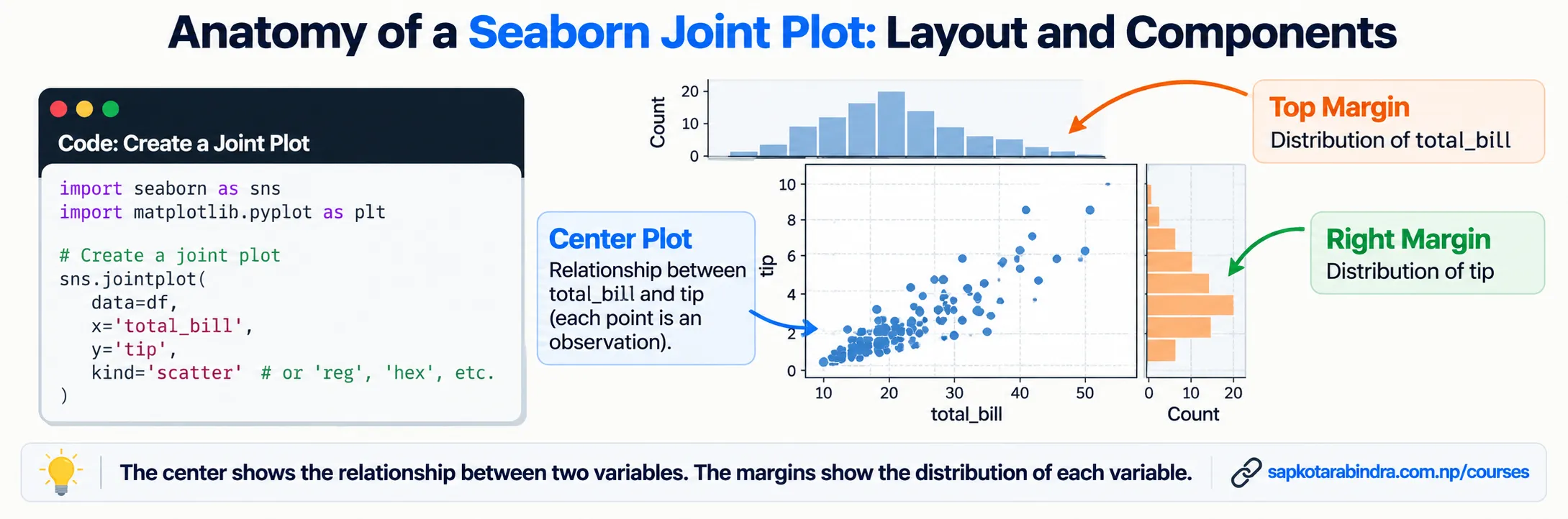
jointplot()displays: the relationship between two variables in the center, individual distributions along the margins. It returns aJointGridand supports plot types such as scatter, KDE, histogram, hexagonal binning, regression, and residual plots.
16.1 🧩 What is jointplot()?
- Example:
import seaborn as snsimport matplotlib.pyplot as pltdf = sns.load_dataset("tips")g = sns.jointplot(data=df,x="total_bill",y="tip",kind="scatter")g.figure.suptitle("Total Bill and Tip",y=1.02)plt.show()📌 The center shows the relationship. The margins show the separate distributions.
16.2 Joint Plot Example
17. Pair Plot
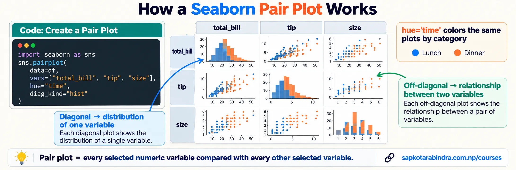
pairplot()shows pairwise relationships among multiple numeric variables. By default: diagonal plots show individual variable distributions, off-diagonal plots show relationships between pairs of variables. It returns aPairGridfor further customization.
17.1 🔲 What is pairplot()?
- Example:
import seaborn as snsimport matplotlib.pyplot as pltdf = sns.load_dataset("tips")g = sns.pairplot(data=df,vars=["total_bill","tip","size"],hue="time")g.figure.suptitle("Pairwise Relationships",y=1.02)plt.show()📌 Use vars to limit the number of variables and keep the grid readable.
17.2 Pair Plot Example
18. Changing Context and Color Palette
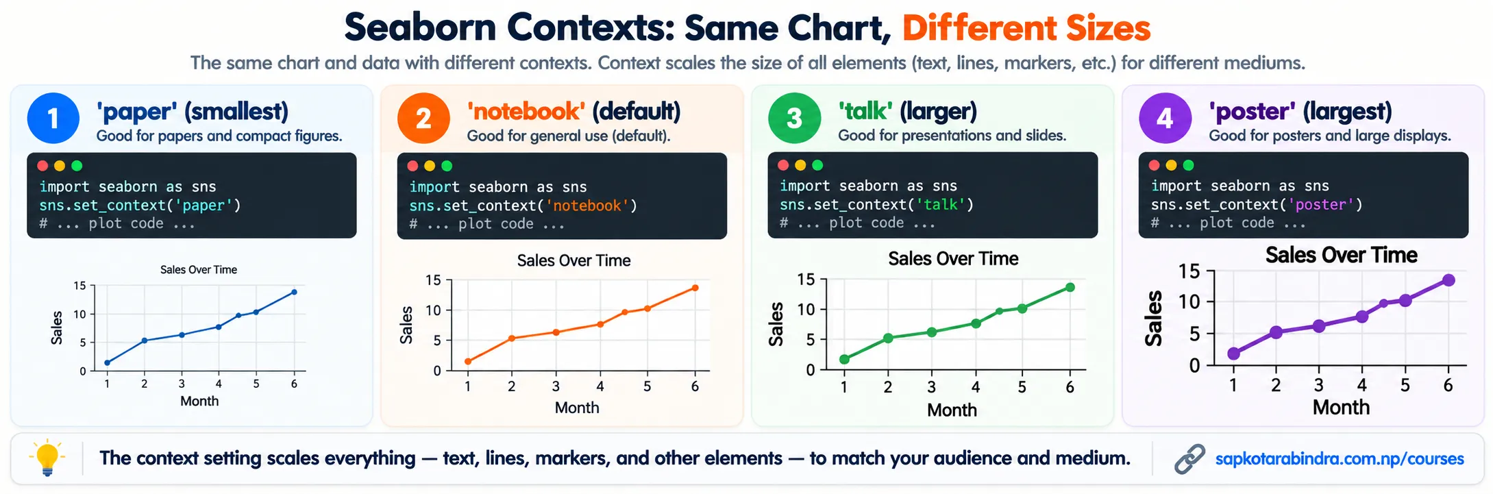
- Context controls the scale of chart elements such as: font size, labels, lines, markers. Set context using:
sns.set_context("context_name")Example:sns.set_context("talk")
18.1 🔠 What is Context?
Available Contexts
| Context | General Size |
|---|---|
| paper | Smallest |
| notebook | Default |
| talk | Larger |
| poster | Largest |
- A color palette controls the colors used in Seaborn charts.
Set a palette using:
sns.set_palette("palette_name")Common palettes include:deep,muted,bright,pastel,dark,colorblind. Example:sns.set_palette("colorblind") - We can configure style, context, and palette together.
Example:
import seaborn as snsimport matplotlib.pyplot as pltsns.set_theme(style="whitegrid",context="talk",palette="colorblind")df = sns.load_dataset("tips")fig, ax = plt.subplots()sns.scatterplot(data=df,x="total_bill",y="tip",hue="day",ax=ax)ax.set_title("Total Bill and Tip")plt.show()📌 Use style for the background and grid, context for element size, and palette for colors.
18.2 What is a Color Palette?
18.3 Setting an Overall Theme