
Data Visualization Concepts
✕1. Introduction to Data Visualization
- Data visualization means presenting data using charts, graphs, and other visual elements. It helps us understand information more quickly than reading large tables of numbers. 📌 Imagine looking at twelve months of sales in a table. A line chart can show the overall trend almost immediately.
1.1 📊 What is Data Visualization?
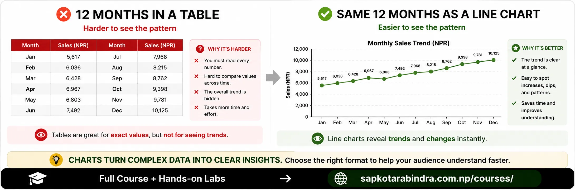
- Data visualization is useful for: 👉 Summarizing data 👉 Identifying patterns 👉 Comparing categories 👉 Tracking changes over time 👉 Discovering relationships 👉 Finding unusual values 👉 Communicating insights 👉 Supporting decisions 📌 Visuals compress complex data into patterns that are easier to interpret.
- Visualization serves two important purposes. During Exploratory Data Analysis Charts help us: ➜ Understand distributions ➜ Identify outliers ➜ Discover patterns ➜ Compare variables ➜ Investigate relationships During Communication Charts help us: ➜ Explain findings ➜ Highlight important results ➜ Support recommendations ➜ Tell a clear data story 📌 During exploration, charts help us discover insights. 📌 During communication, charts help us explain those insights.
1.2 Why is Data Visualization Important?
1.3 Data Visualization in EDA and Communication
2. Choosing the Right Visualization
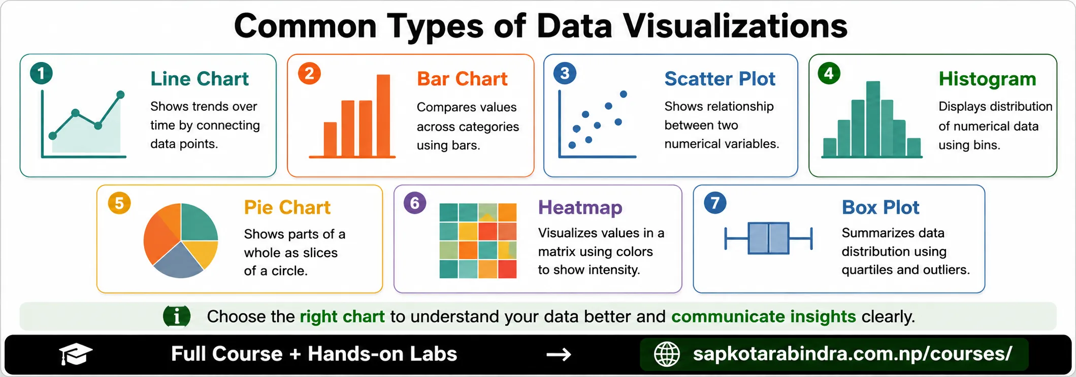
- Different charts answer different types of questions. Before selecting a chart, ask: 👉 Are we comparing categories? 👉 Are we tracking a trend? 👉 Are we examining a distribution? 👉 Are we studying a relationship? 👉 Are we showing parts of a whole? 👉 Are we looking for outliers? 📌 Choose the chart based on the question you want to answer.
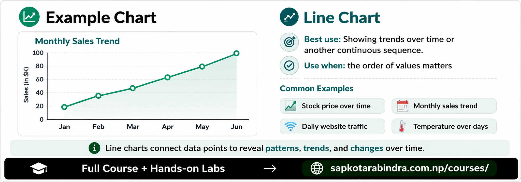
- Best use: Showing trends over time or another continuous sequence. Data relationship: Time or continuous variable compared with a numeric variable. Examples: - Stock price over time - Monthly sales trend - Daily website traffic - Temperature over several days 📌 Use a line chart when the order of values matters.
2.1 🎯 Why Chart Selection Matters
2.2 📈 Line Chart
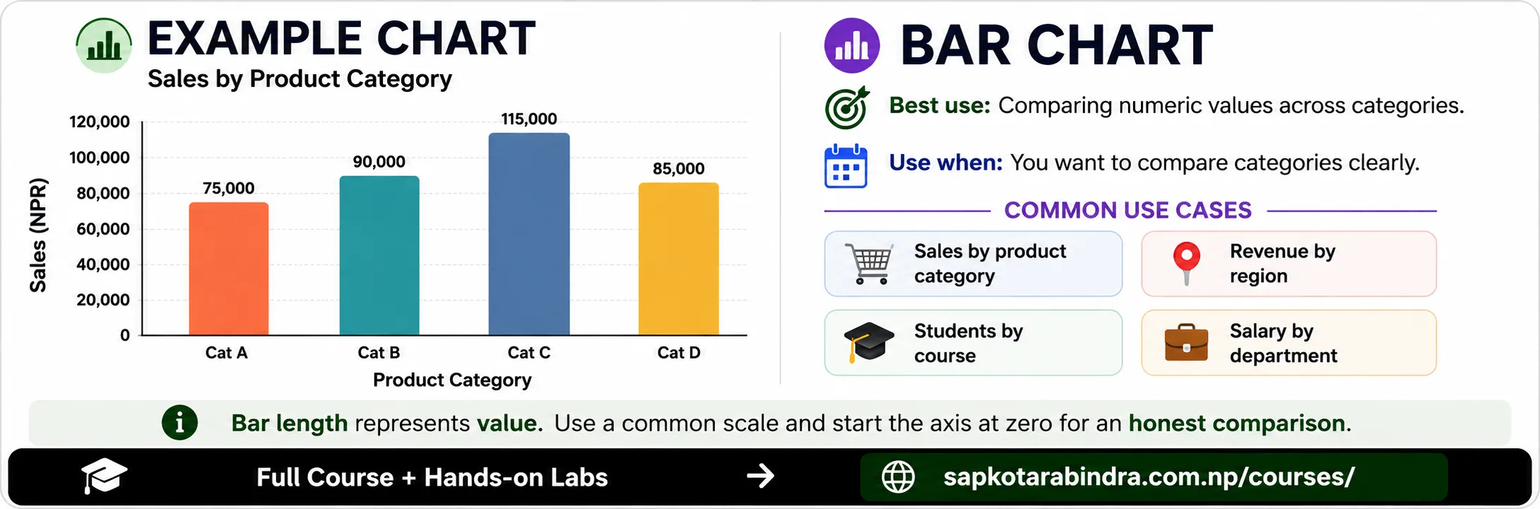
- Best use: Comparing numeric values across categories. Data relationship: Categorical variable compared with a numeric variable. Examples: - Sales by product category - Revenue by region - Number of students by course - Average salary by department 📌 Use a bar chart when you want to compare categories clearly.
2.3 📊 Bar Chart
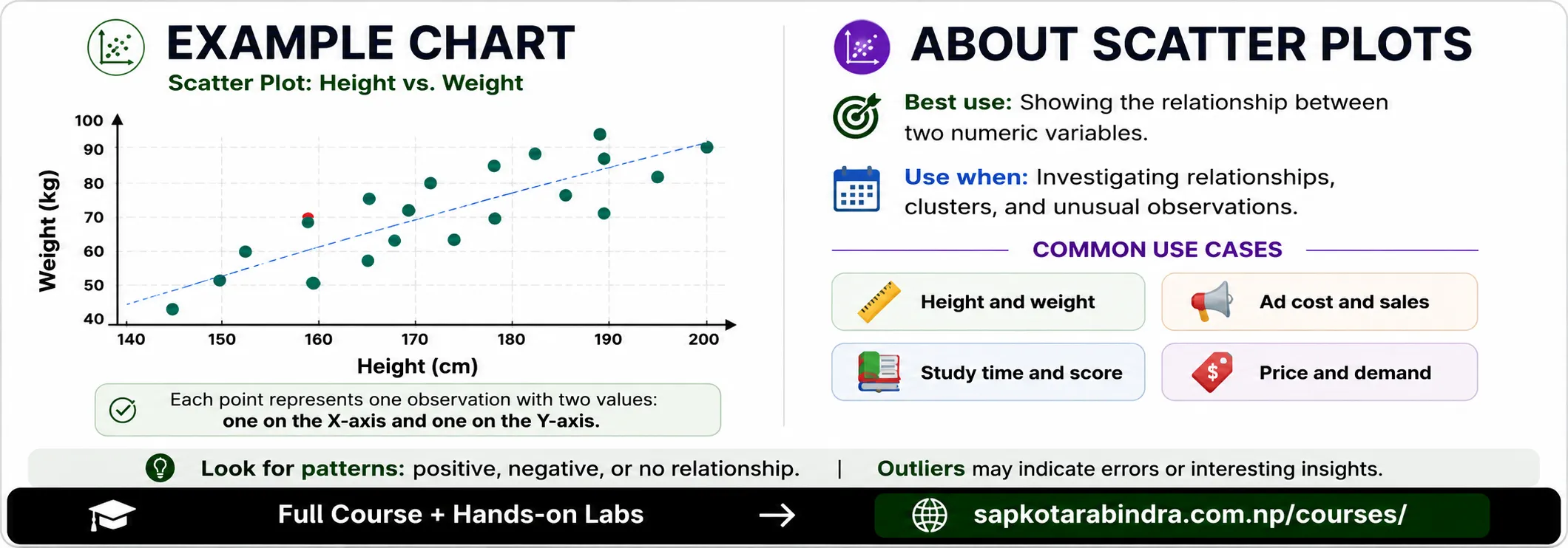
- Best use: Showing the relationship between two numeric variables. Data relationship: Numeric variable compared with another numeric variable. Examples: - Height and weight - Advertising cost and sales - Study time and exam score - Product price and demand 📌 Use a scatter plot to investigate relationships.
2.4 🔗 Scatter Plot
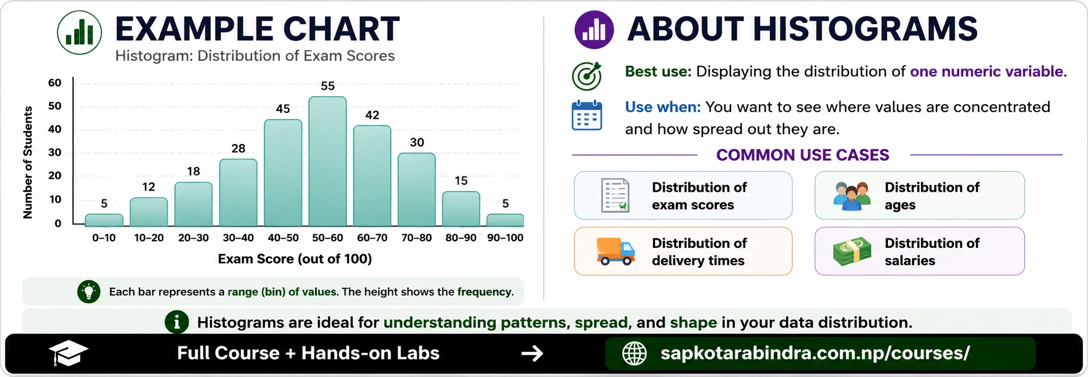
- Best use: Displaying the distribution of one numeric variable. Data relationship: One numeric variable divided into intervals or bins. Examples: - Distribution of exam scores - Distribution of customer ages - Distribution of delivery times - Distribution of employee salaries 📌 Use a histogram to see where values are concentrated and how they are spread.
2.5 🔍 Histogram
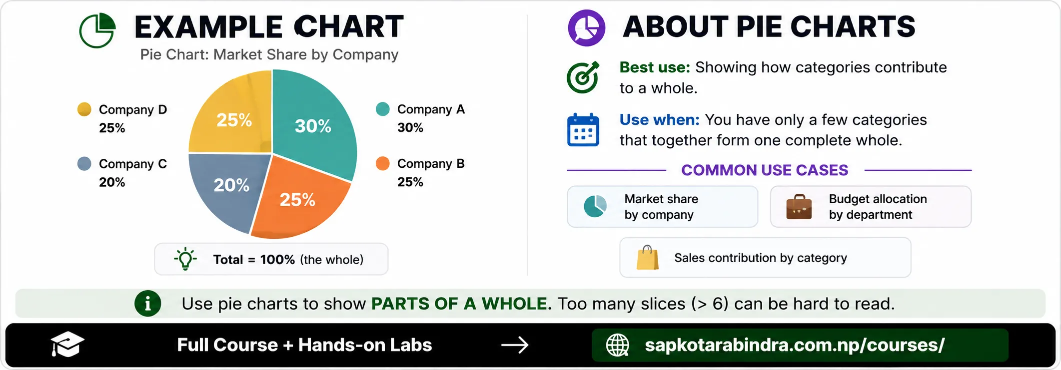
- Best use: Showing how categories contribute to a whole. Data relationship: Categorical variable compared with a numeric value or percentage. Examples: - Market share by company - Budget allocation by department - Sales contribution by product category 📌 Pie charts work best with only a few categories whose values form one whole.
2.6 Pie Chart
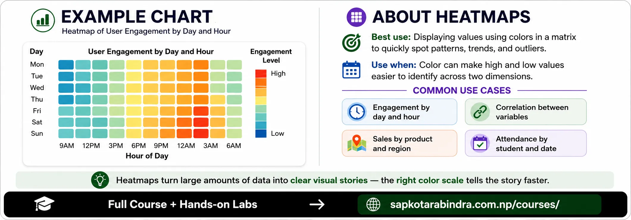
- Best use: Displaying values using colors in a matrix. Data relationship: Two dimensions represented by rows and columns, with numeric values represented by color. Examples: - User engagement by day and hour - Correlation between numeric variables - Sales by product and region - Attendance by student and date 📌 Use a heatmap when color can make high and low values easier to identify.
2.7 Heatmap
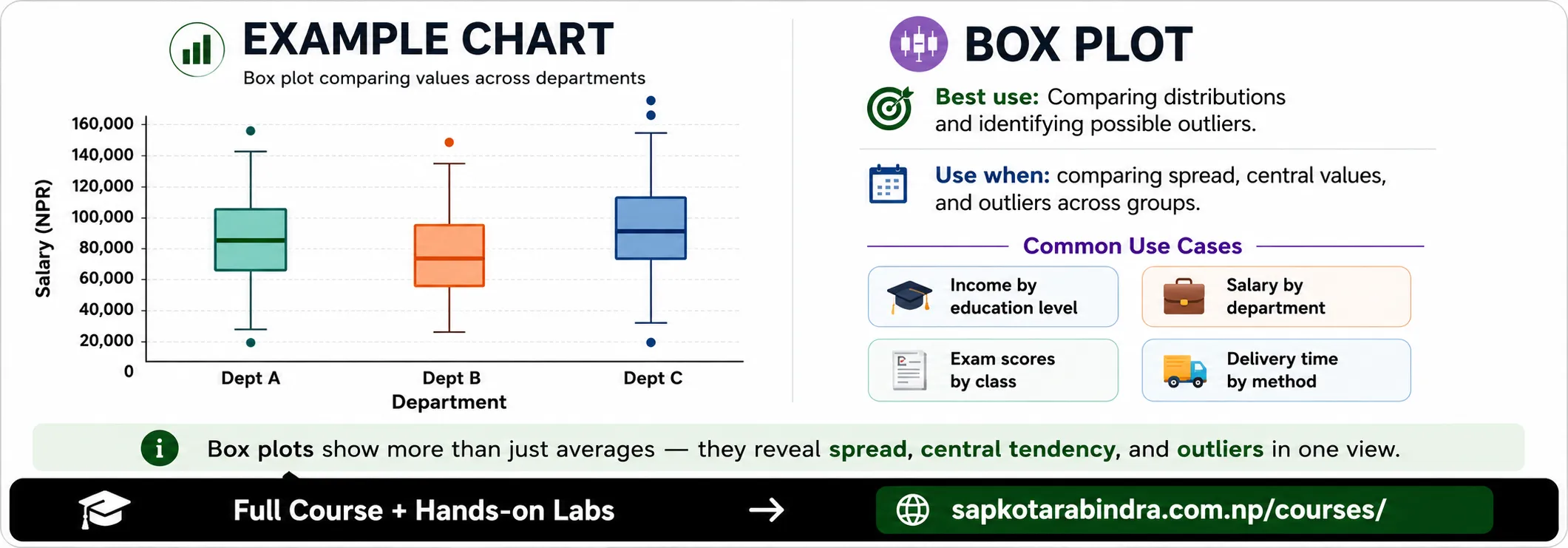
- Best use: Comparing distributions and identifying possible outliers. Data relationship: A categorical variable compared with a numeric variable. Examples: - Income distribution by education level - Salary distribution by department - Exam-score distribution by class - Delivery time by shipping method 📌 Use a box plot to compare spread, central values, and possible outliers across groups.
2.8 Box Plot
2.9 Quick Chart Selection Guide
| Question | Chart |
|---|---|
| How does a value change over time? ➜ Understanding trend | Line chart |
| What is revenue across different regions? ➜ Comparing values across categories | Bar chart |
| Are two numeric variables related? ➜ Understanding the relationship | Scatter plot |
| How is customer satisfaction distributed? ➜ Distribution of a single variable | Histogram |
| How much marks is contributed by each topic? ➜ Contribution of each category to the total | Pie chart |
| How are sales distributed across region and product? ➜ Compare intensity across two dimensions | Heatmap |
| How do distributions and outliers compare across groups? ➜ Spread, Central tendency, Outlier of different groups | Box plot |
3. Chart Design Principles
- Avoid unnecessary elements that do not support the message. Examples of unnecessary elements include: - Excessive colors - Decorative backgrounds - Too many grid lines - Unnecessary labels - 3D effects - Repeated information 📌 Every visual element should have a purpose.
3.1 ✨ Keep the Chart Simple
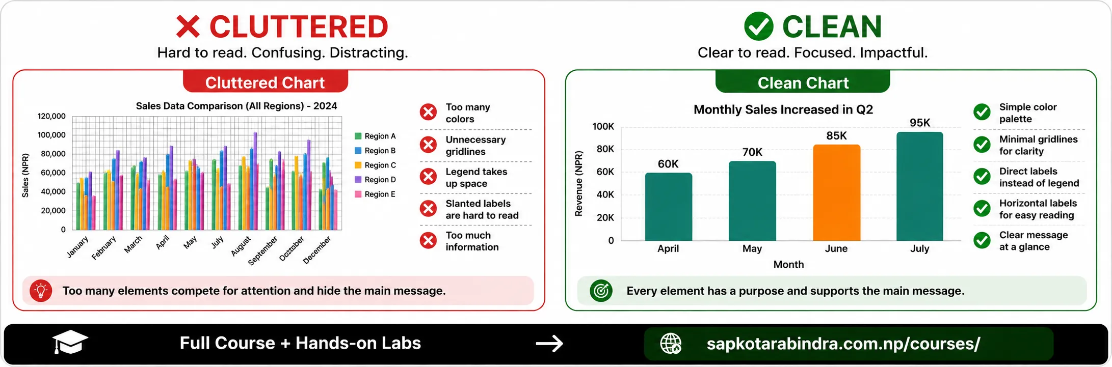
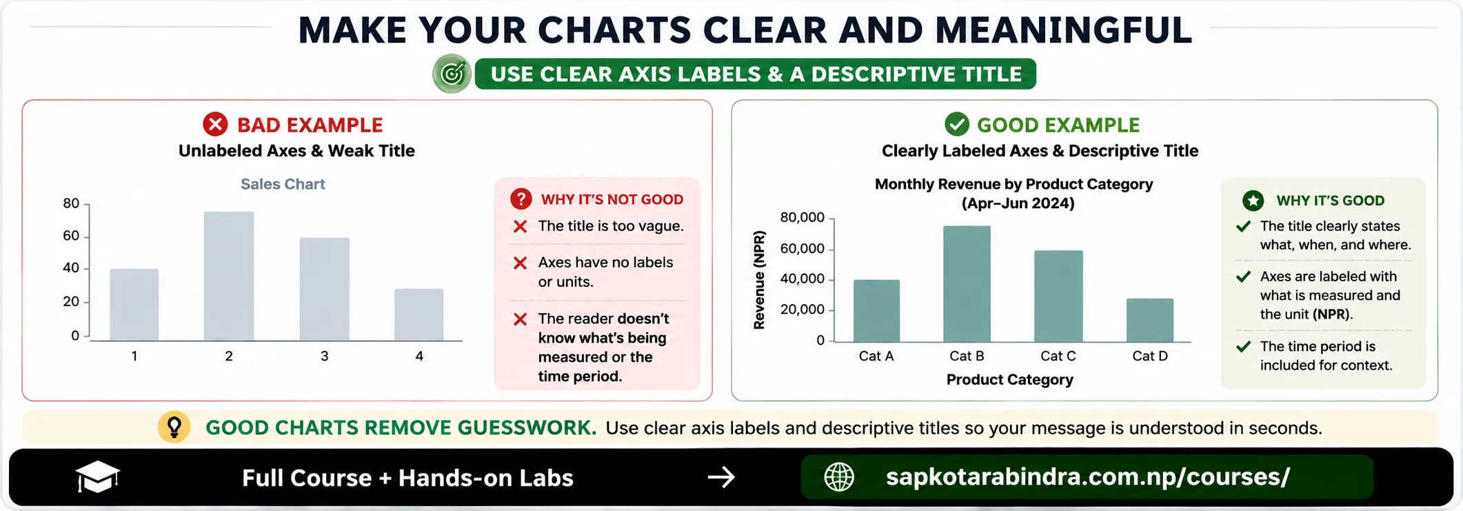
- The title should explain what the chart shows. Weak title: Sales Chart Better title: Monthly Sales Increased During the Second Quarter 📌 A descriptive title helps readers understand the main message.
- Axis labels should explain: ✅ What the values represent ✅ The measurement unit ✅ The time period, when relevant Example: X-axis: Month Y-axis: Revenue in NPR
3.2 Use a Clear Title
3.3 Label Axes Clearly
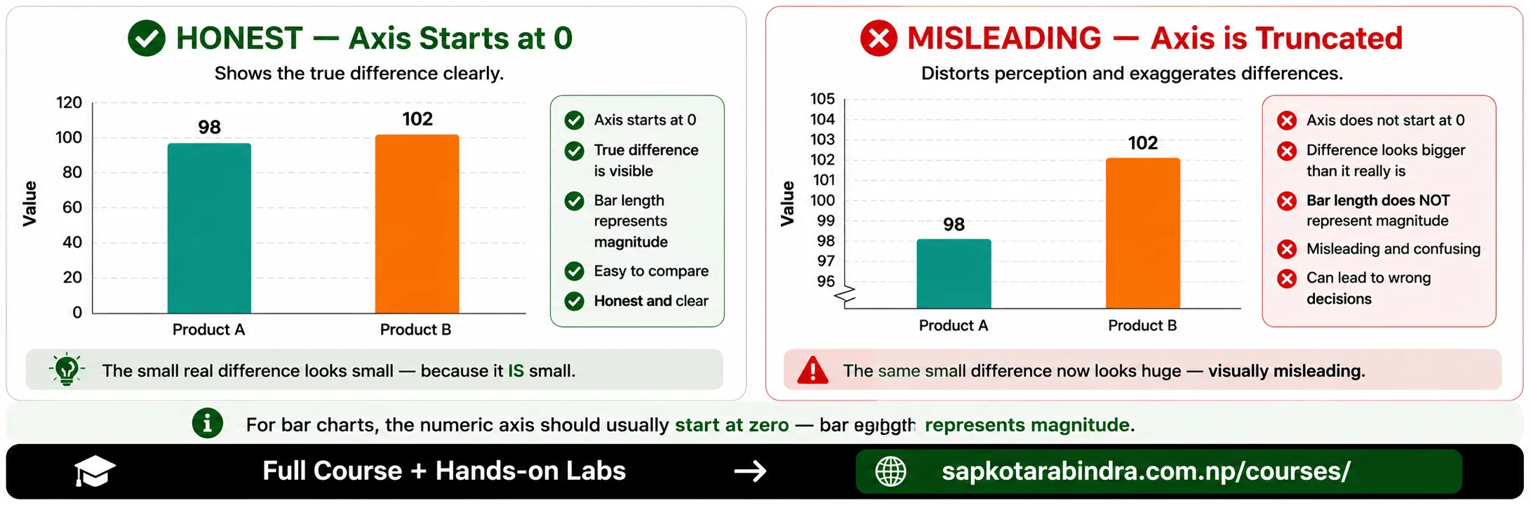
- The scale should represent the data honestly. Avoid: - Cropping axes in a way that exaggerates differences - Using inconsistent intervals - Mixing unrelated units on the same axis - Using a scale that hides important variation 📌 Misleading scales can make small differences appear much larger than they are.
- Color can be used to: - Separate categories - Highlight an important value - Show high and low values - Represent groups consistently Avoid using many colors without a clear reason. 📌 Color should communicate information, not simply decorate the chart.
- Labels and legends should be: - Clear - Short - Easy to locate - Consistent with the chart colors If categories can be labeled directly, a separate legend may not be necessary.
- When presenting multiple charts, use consistent: - Fonts - Colors - Number formats - Date formats - Category names - Axis styles 📌 Consistent formatting makes multiple charts feel like one connected data story.
- Charts should remain understandable for different audiences. Helpful practices include: - Using readable font sizes - Providing sufficient color contrast - Avoiding color as the only way to communicate meaning - Adding labels where appropriate - Choosing color palettes that remain distinguishable
3.4 Use Appropriate Scales
3.5 Use Color Purposefully
3.6 Use Readable Labels and Legends
3.7 Maintain Consistent Formatting
3.8 Consider Accessibility
4. Avoiding Misleading Visualizations
- A bar chart with a shortened numeric axis can exaggerate small differences. For bar charts, the numeric axis should usually begin at zero because bar length represents magnitude.
4.1 ⚠️ Avoid Truncated Axes When They Distort Comparison
- Too many categories can make a chart difficult to read. Possible solutions:
✅ Show the most important categories
✅ Group smaller categories as
Other✅ Use a horizontal bar chart ✅ Split the information into multiple charts - Three-dimensional effects can distort shapes and make values harder to compare. Prefer simple two-dimensional charts unless the third dimension represents real data.
- One chart should communicate one main insight whenever possible. If a chart answers too many questions at once, consider creating separate charts. 📌 A clear chart is usually more useful than a complicated chart.
4.2 Avoid Too Many Categories
4.3 Avoid Unnecessary 3D Effects
4.4 Avoid Overloading One Chart
5. Telling a Data Story
- Data storytelling combines: - Data - Visuals - Explanation - Context A single chart may show one result, while several related charts can build a larger story.
- A data story can follow this structure: 1. Introduce the question 2. Show the relevant data 3. Highlight the important pattern 4. Explain why it matters 5. Present the conclusion or recommendation
5.1 📖 What is Data Storytelling?
5.2 Simple Data Story Structure
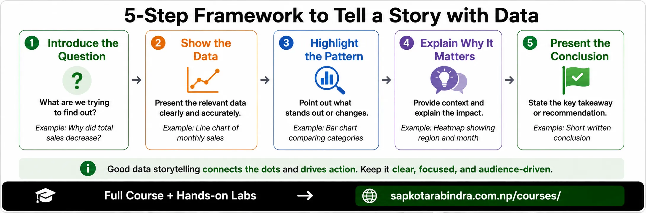
- Question: Why did total sales decrease? Possible visual sequence: ➜ Line chart showing monthly sales ➜ Bar chart comparing sales by product category ➜ Heatmap showing sales by region and month ➜ Short conclusion explaining the main cause 📌 Multiple charts should support one connected message, not present unrelated information.
5.3 Example
6. Final Chart Checklist
- Before presenting a visualization, check: ✅ Does the chart answer a clear question? ✅ Is the chart type appropriate? ✅ Is the title meaningful? ✅ Are axes and units labeled? ✅ Is the scale honest? ✅ Are colors used consistently? ✅ Are labels readable? ✅ Is unnecessary information removed? ✅ Is the main insight easy to identify? ✅ Is the chart accessible to the intended audience? 📌 A good visualization makes the intended message easier to understand, not harder.
6.1 Before Presenting